Grub Lab App Redesign
The Problem:
I was the Design Team Lead across many projects with Grub Lab. I worked end-to-end on the redesign of the Grub Lab app. Grub Lab is a kid’s entertainment start-up that creates activity packs, these packs pair with the Grub Lab app to create AR (augmented reality) experiences. These packs are used for families when dining out so this app needs to fulfill the needs of families, both children and parents as well as the hospitality venue owners that purchase the printed packs. There were varied challenges and stakeholder needs to meet whenre-designing the Grub Lab app so I’ll break it down..
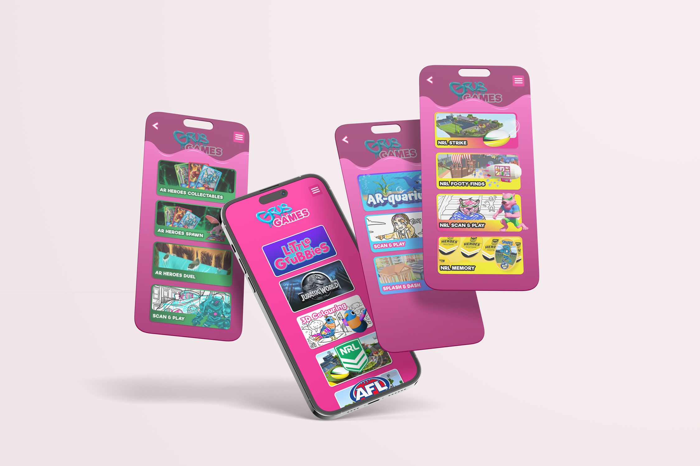
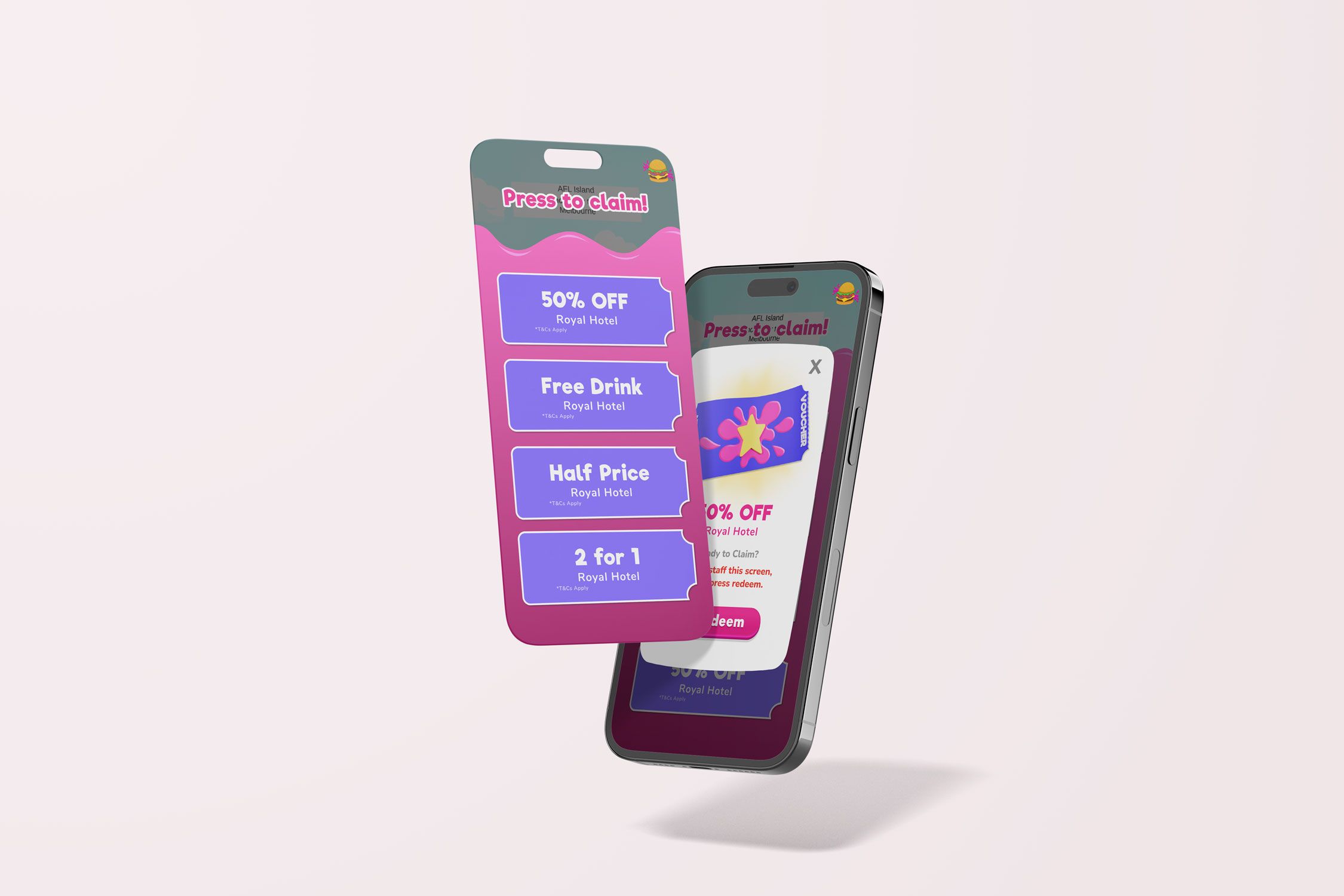
The brief for the redesign of the Grub Lab app was to consolidate all the current games and AR experiences into one app for a more seamless customer experience. Previously each series was going to have its own app. The users of this app are children aged 3-12, the goal is for children to be entertained whilst waiting for their meal, this means the app needs to have a range of casual games, the parent also needs to be directed to the app from the activity pack so they know to download. A child needs to be able to use this app independently. The app also needed to cater to venue owners, features were available for purchase which included the venue being able to place their own logo in the app on the welcome screen as well as being able to send vouchers out to patrons. The design needed to have these features included and visible so they weren’t missed by users. The update also needed to stay true to the Grub Lab brand whilst including licensed brands. The brands have stringent guidelines to adhere to, as well as providing limited access to approved assets. All content that was created using these brands had to be submitted for external approval. This was an almost complete overhaul of the original design system to meet all stakeholder needs.
The timeline for this project was tight due to other business objectives needing to be met and limited resources. Due to time constraints and this being an update on an existing product there were steps along the process that were not completed in great detail, I also carried over certain elements of the previous design system to meet the deadline. This was also my first large scale project as a Design Lead. I learnt a lot about end-to-end product development that I will take with me and build upon moving forward.
The Process:
Research and Visual Concept:
Due to this app being an update on an existing product the team broke down the learnings from issues with the previous app’s design, this design did not include the current features that meet the needs of venue owners.
The previous learnings were collated and broken out into actionable tasks. This included breaking down which parts of the design system were working and which ones were not. It also allowed a clear path to see which experiences and features were missing or could be improved upon.
An essential part of the design process is to research what your competitors are doing and see what the latest design trends are. For this project I looked at other mobile apps that were serving the 3-12 age range, I looked in the categories of entertainment, casual gaming and education. I gather images and place them into a board, grouping similar concepts and ideas, I also annotate on this board, this is where I begin to form a concept and vision for the look and feel. From this it's important to analyse which images and pieces of research best fit the brand and project.
User Flows:
The next step was to create a user flow, this visually forms the outline to the design without having to consider the UI. User flows also allow you to iron out potential issues or find steps that may have been missed before time is spent designing. This flow was reviewed across the design and tech team as well as with the product owner.

User Flow
Sketching and Wire framing:
I enjoy working on paper before jumping into Figma, it allows me to be messy and to have freedom to work through ideas without pressure. I will use the user flow as a guideline for my sketches as well as leaning on the visual research board I compiled.
I like to discuss and walk through my sketches with the development team before designing, this allows me to have an understanding of the feasibility of my ideas. Often these discussions can lead to possibilities I may not have considered.
For this particular project I did not do wireframes for the entire app, this was due to both time constraints and also because some of the design system remained unchanged or only slightly tweaked. I completed wireframes for the new screens.

Sketches and wireframe examples
Prototyping and User Testing:
Prototypes for this project were tested and reviewed in Figma. Specific games and AR experiences had test apps which were tested and reviewed by the internal team. Testing would lead to actionable tasks being created to iron out any issues before release.
Design System and High Fidelity Design:
The design system was created and managed in Figma. I begin by pulling in all the wireframes and screens I need and laying them out using the user flow as a guide. I then set up my colours, components and variants and work through building the wireframes out to high fidelity screens.
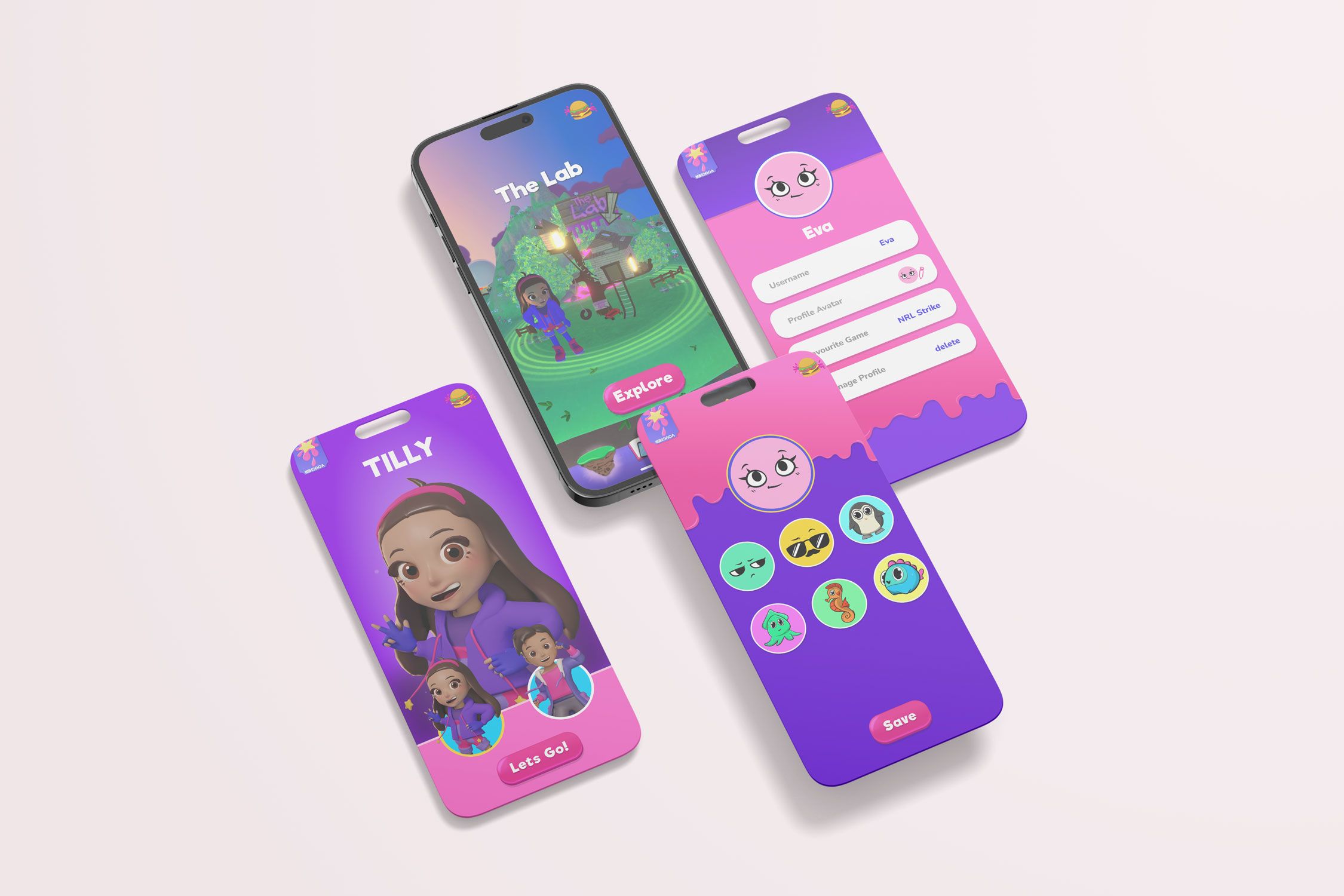
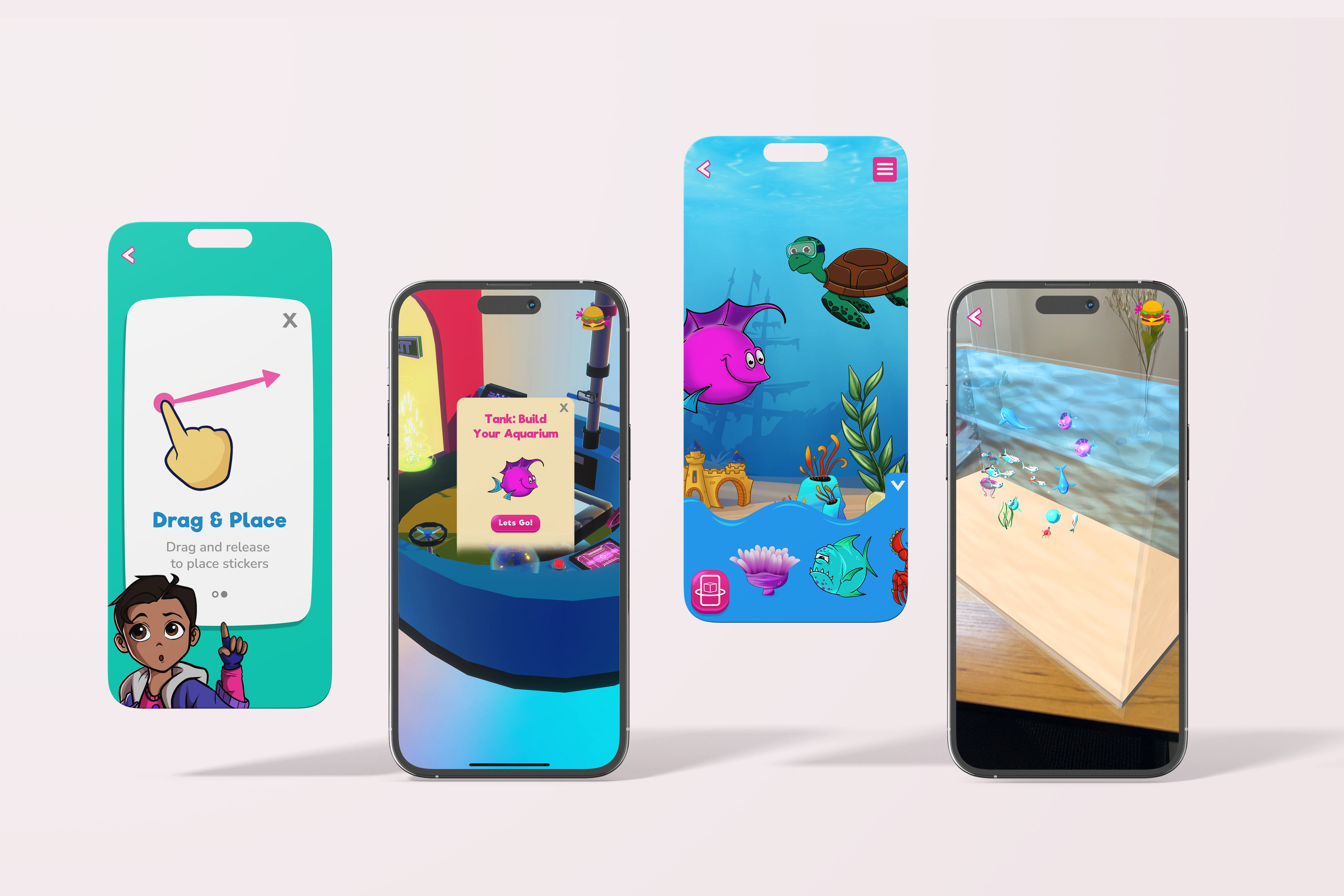
To serve the needs of young children, under the age of being able to read I endeavoured to create an experience that was intuitive and used minimal words. There are onboarding screens and help messaging to follow if needed as well as instruction on the Scan & Play feature in the inside cover of the physical pack. To satisfy venue owners their logo appears on the welcome screen when opening the app and the available vouchers sit accessible on the home screen, the voucher button is also animated to draw the user's eye.
For licensed content I used approved assets and colours where relevant and categorised all brands so experiences and games were kept separated, to adhere to guidelines around storytelling.
From Figma all assets were exported and sized ready to implement with the development team, I also frequently checked in with the development team throughout the creation of the high fidelity file to make sure there was no miscommunication.

High Fidelity Figma Design
Iteration:
One of the things I love about digital design is iterative nature. Through user feedback after the app had been released the team gained insights that showed the user experience when selecting games from the 3D selection menu was frustrating. Users were accidentally pressing and accessing the world when the intended action was to swipe and rotate the carousel, to fix this I added a button that needed to be pressed before the character would enter the world.
Key Learnings:
This was my first large-scale project as a Design Lead, I had many takeaways from this experience that I will carry with me into the future. One of the most beneficial was how to effectively communicate especially across multi-faceted teams. Continued check-ins with the product owner and development team made handing the project over simple and quick. This project also taught me how to effectively work with large brands and their IP requirements.
Design Lead | UX/UI Design | Illustration | Concept